
Branding That’s Built to Last
At Arrowhead, we talk about “branding” every day, but for Dixie Land Angus, we got to take that term quite literally. This project was a unique dive into the intersection of tradition and modern marketing, where the goal was to create a logo that could quite literally be seared into the identity of the business.
- Functional Simplicity: We designed a mark with clean, bold lines. Why? Because a cattle brand needs to be recognizable from a distance and simple enough to be reproduced in iron. We stripped away the noise to find a silhouette that commands respect in the show ring.
- Industry-Informed Aesthetics: We utilized heavy, stable fonts and a classic color palette that resonates with the agricultural community. It’s a look that signals reliability, heritage, and the high-quality Angus standards the client is known for.
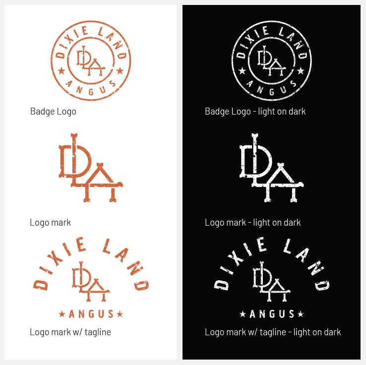
- A Versatile Visual Toolkit: A modern farm doesn’t just live in the field; it lives on social media and at trade shows. By providing a main logo, a secondary version, and a dedicated social icon, we’ve given Dixie Land Angus the flexibility to look professional on everything from hats and vests to Instagram and Facebook.
From the “creative juices” in the studio to the dust of the local show, we are thrilled with how this identity came together. It’s a rugged, professional brand for a business that’s proud of its roots.