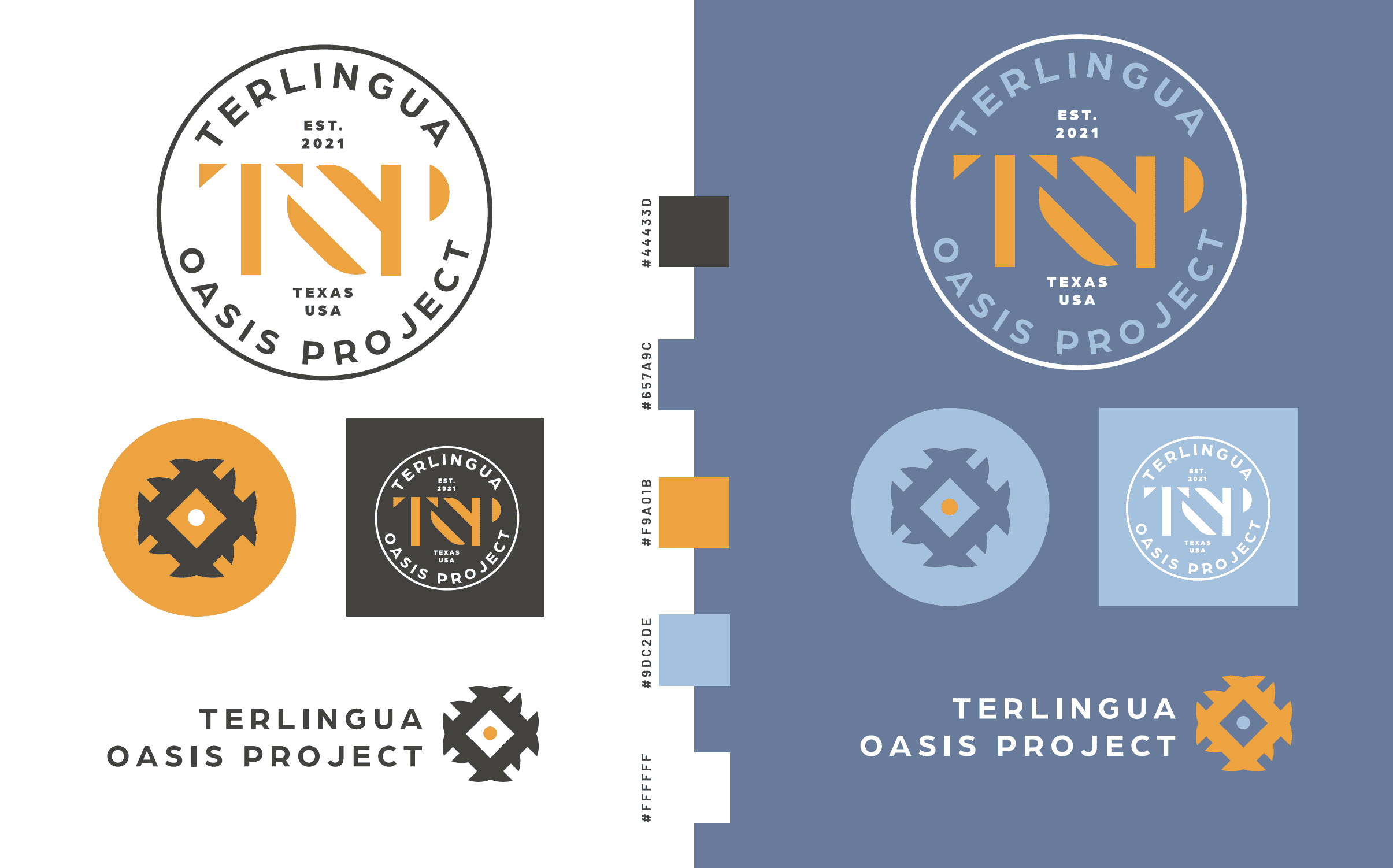
Resilience by Design: Branding the Desert
Permaculture in the high desert isn’t just farming; it’s a form of environmental art. For the Terlingua Oasis Project in Brewster County, Texas, the brand needed to be as hardy as the 41 acres it represents. Our task was to take the raw inspiration of West Texas vegetation and turn it into a professional, scalable product identity.
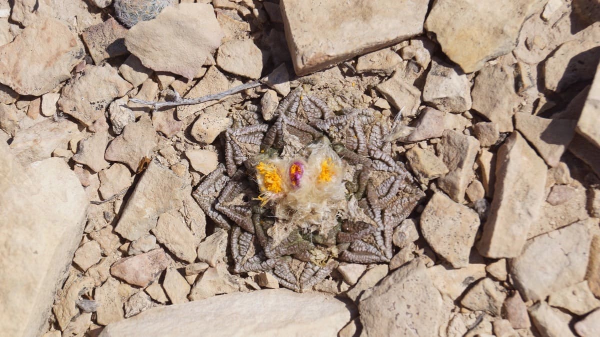
- Locally-Inspired Iconography: We didn’t use generic symbols. By using the “Living Rock Cactus” as our primary reference, we created a brand mark that belongs specifically to the Chihuahuan Desert. It’s an immediate “trust signal” for anyone who knows and values the Terlingua landscape.
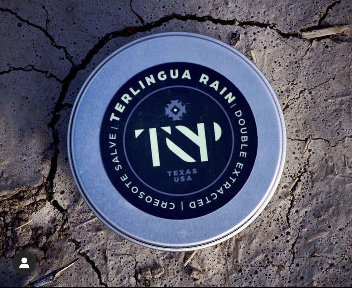
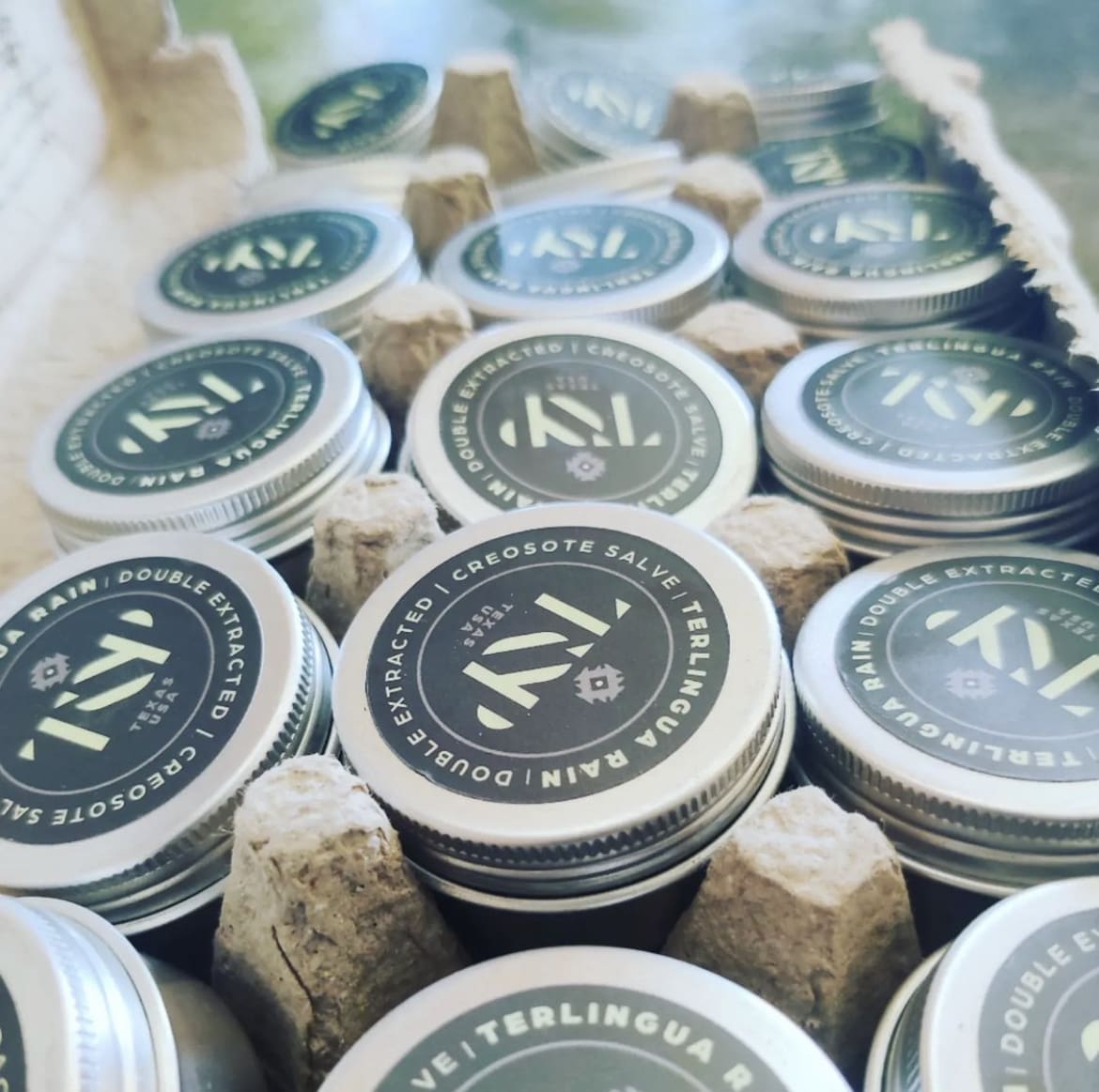
- A Unified Product Ecosystem: We built a modular logo system. Whether it’s the primary “Top Perma” logo or the specialized “Terlingua Rain” packaging, the visual language remains consistent, allowing the farm to grow its product line while maintaining a single, recognizable voice.
- Desert-Toned Palette: We utilized a color range that mirrors the environment—dusty, vibrant, and natural. This ensures the packaging feels like an extension of the land itself, appealing to a community that prioritizes sustainability and authenticity.
The result is a brand that feels as established as the desert flora it depicts. By focusing on place-based branding and custom illustration, we’ve given the Terlingua Oasis Project a professional foundation to support their mission of art, community, and sustainable growth.