
Designing for the “Hometown” Advantage
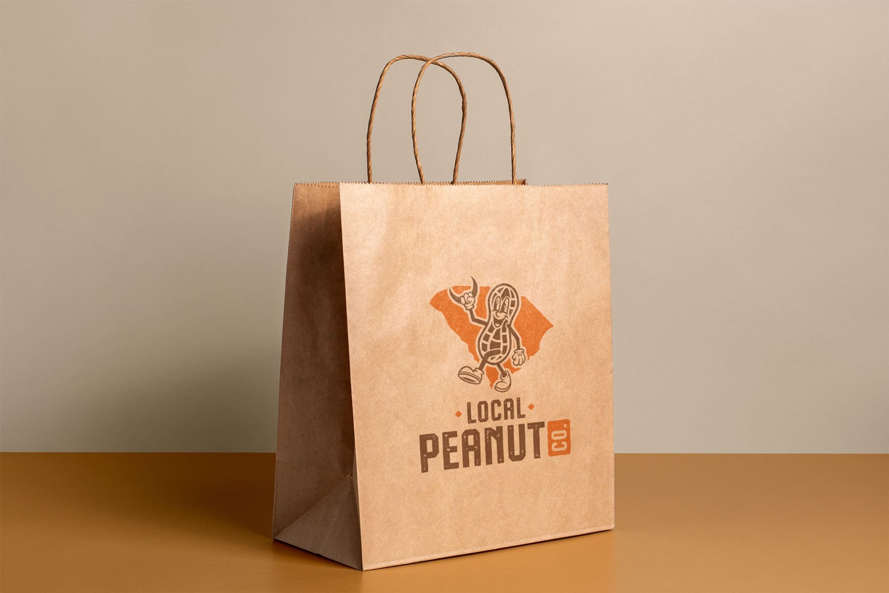
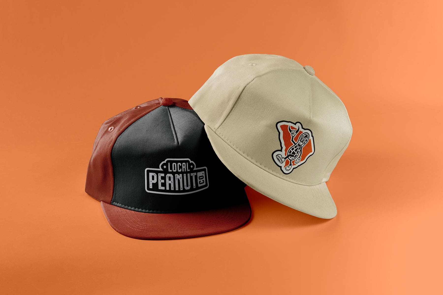
In the world of CPG, a mascot is more than just a drawing; it’s a visual handshake. For Local Peanut Co., we wanted to create a character that felt like it had been around for decades. As they expanded into Hot Spot locations across South Carolina, they needed a brand that looked as good on a t-shirt as it did on a snack bag.
- The Power of a Custom Mascot: We designed a character that literally holds a piece of the state (the SC crescent) to create an immediate emotional connection with local buyers. It’s a “visual trust signal” that says this product is made by and for South Carolinians.
- Retail-Ready Packaging: We focused on high-contrast typography and a landscape-inspired palette to ensure the bags pop against a busy retail background. The design is clean, professional, and built for the quick-moving environment of a convenience store.
- Scalable Identity: By creating a cohesive look across packaging and apparel, we helped Local Peanut Co. move from being “just a snack” to a lifestyle brand that customers actually want to wear.
Since the refresh, the brand has seen a significant increase in recognition and shelf-velocity. By focusing on a “less is more” typographic approach and a high-character illustration, we’ve given Local Peanut Co. the professional edge to compete with national snack brands while keeping their local soul intact.