Heavy-Duty Branding for Heavy-Duty Work
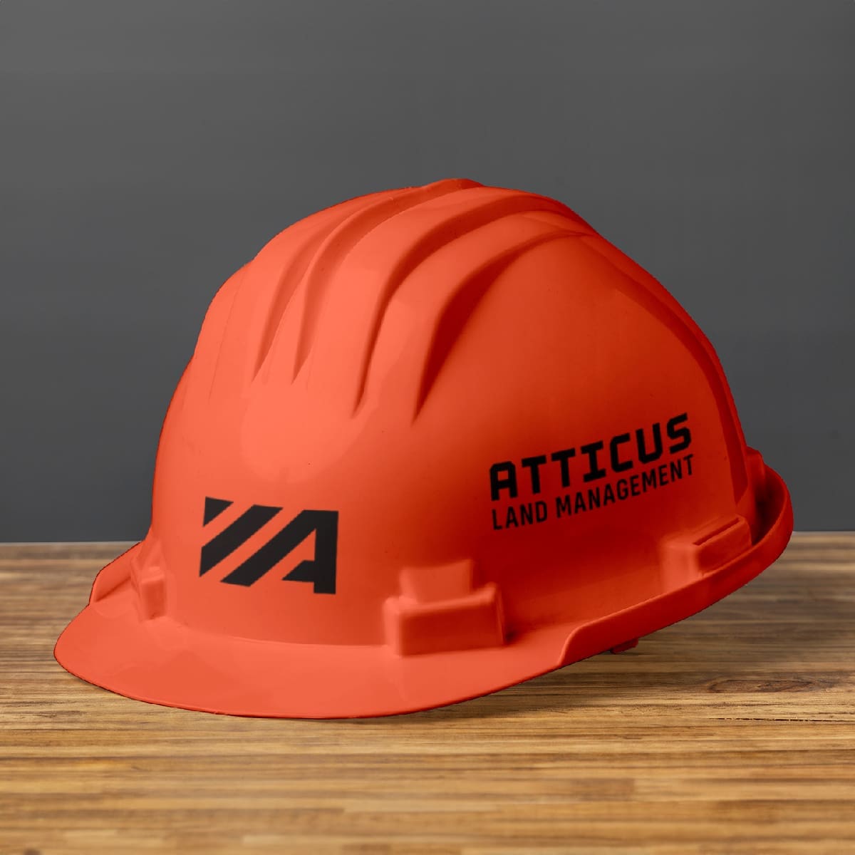
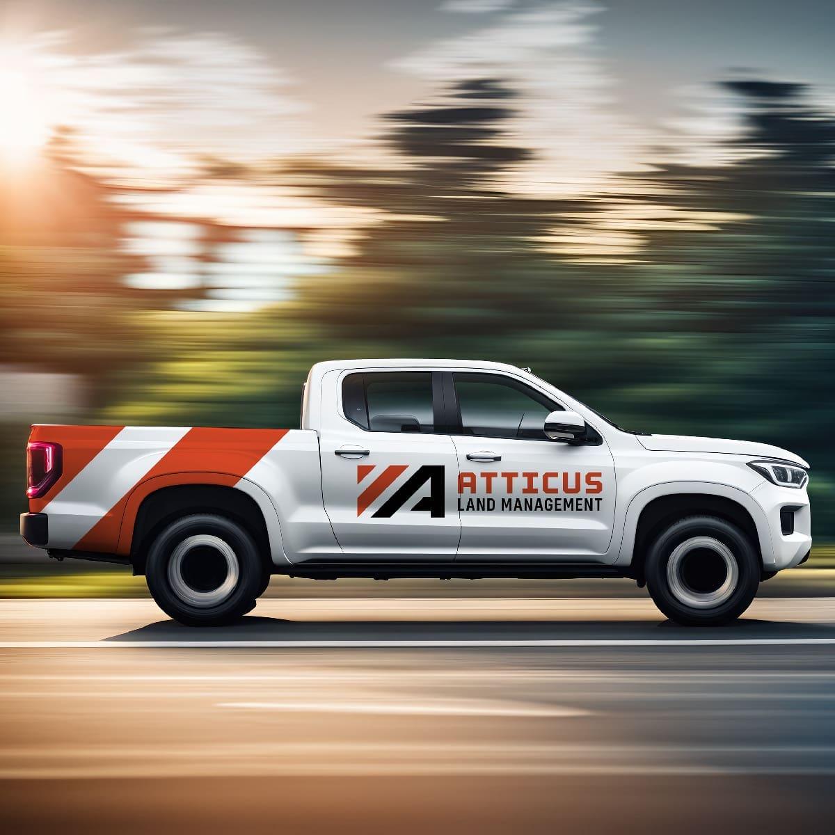
When you’re in the business of moving earth and clearing land, your logo is your handshake before you even arrive at the site. For Atticus Land Management, we wanted to create a visual identity that felt like a piece of high-end machinery—robust, efficient, and ready to work.
- Strategic Color Palette: We leaned into a bold, high-visibility orange. In the world of construction and land management, this color is a universal “trust signal” for reliability and industrial strength.
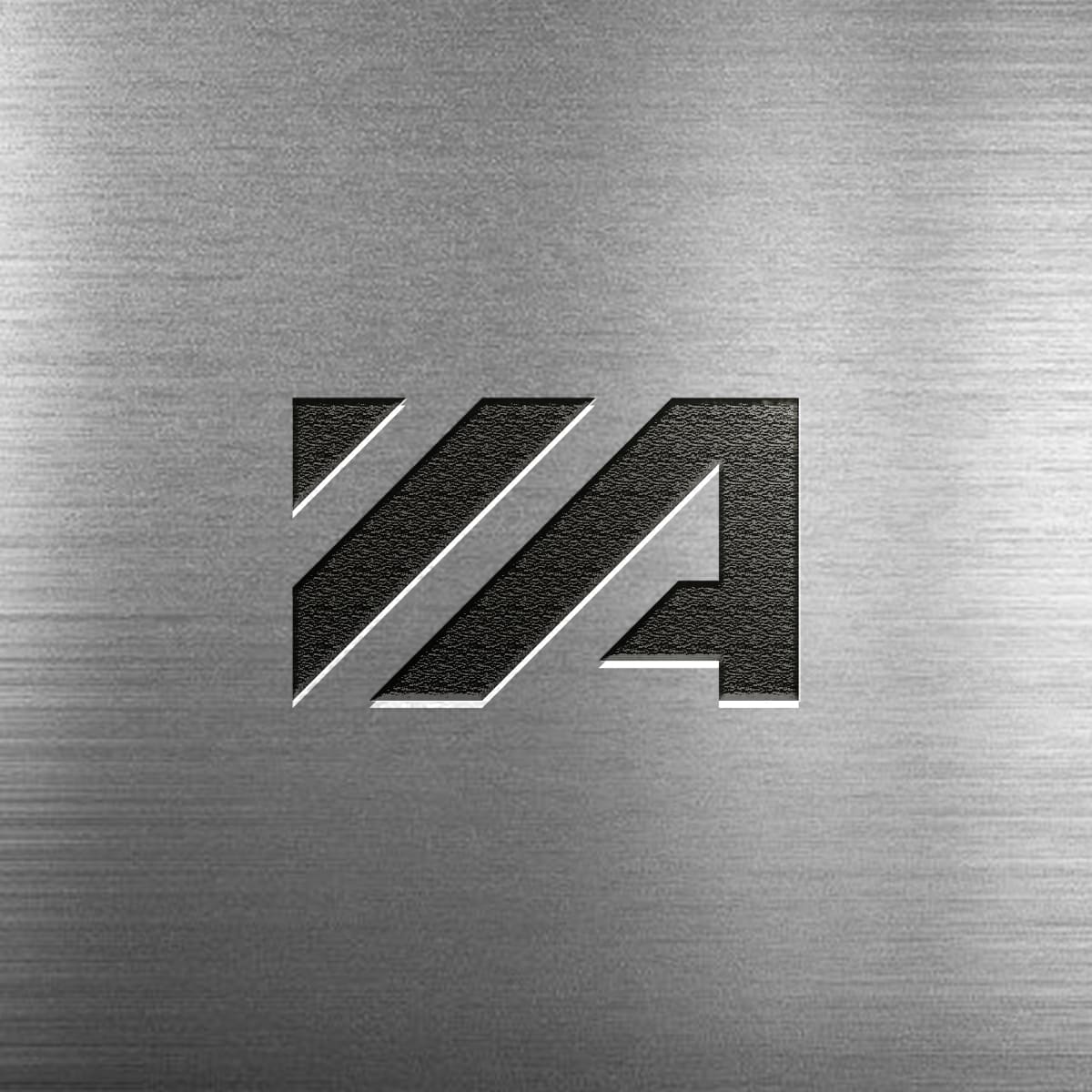
- Rugged Geometry: The shapes within the logo are inspired by land-clearing equipment and heavy-duty tools. This ensures that even at a glance, potential clients understand the power and capability Atticus brings to a project.
- Professional Positioning: This isn’t just a “pretty” logo; it’s a technical asset. In an industry where word-of-mouth is everything, a professional brand acts as a credibility multiplier, helping Atticus attract higher-end contracts and land developers.
A professional brand refresh signals to the market that your company is growing and adapting to modern standards. By focusing on “Recognition and Recall,” we’ve given Atticus Land Management a look that sticks in a client’s mind long after the brush is cleared. It’s a bold, functional foundation built to last as long as the equipment they run.