
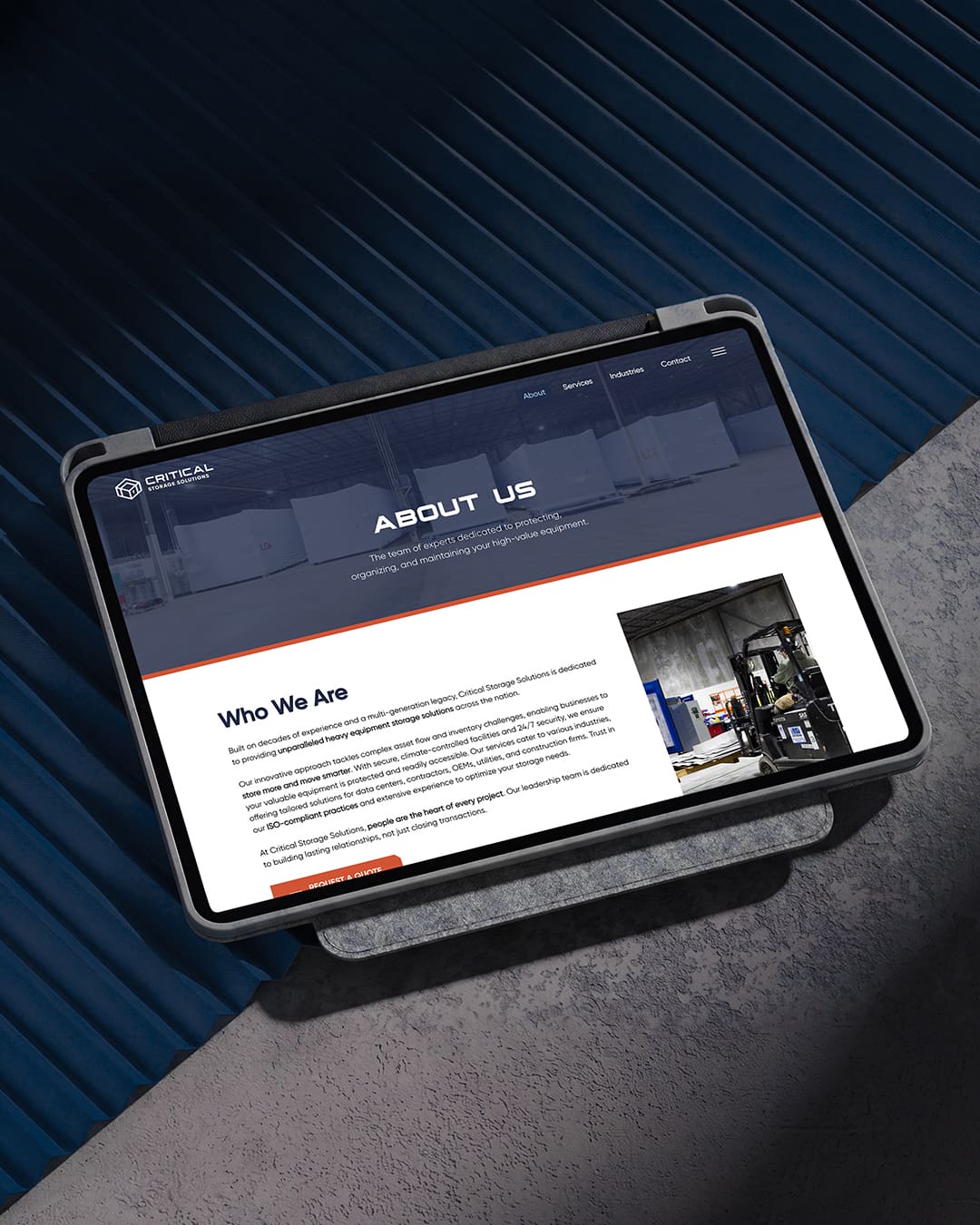
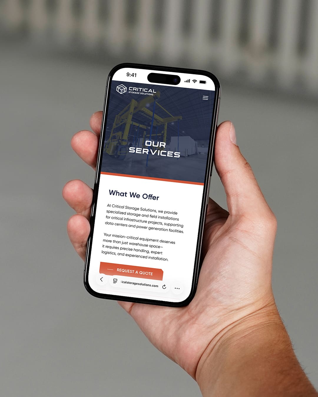
Critical Storage Solutions provides critical equipment storage, logistics, and field installation services for power generation and heavy industrial projects across the country. To support their operations and reach infrastructure partners nationwide, the company partnered with Arrowhead Design Group to build a cohesive visual identity and digital platform from the ground up.
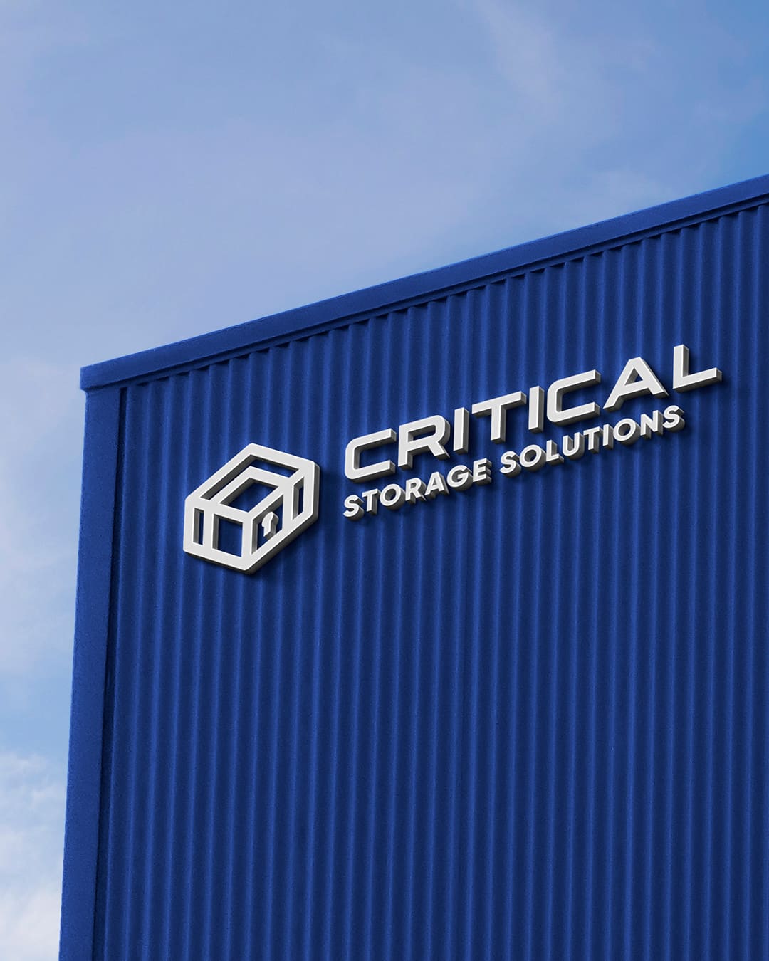
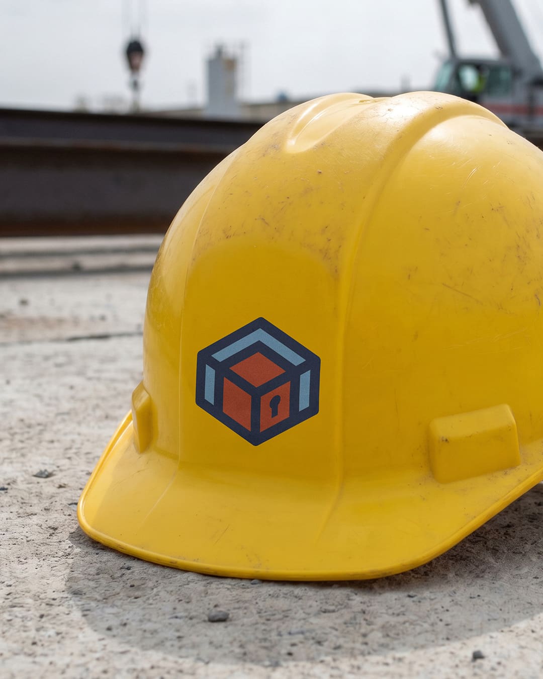
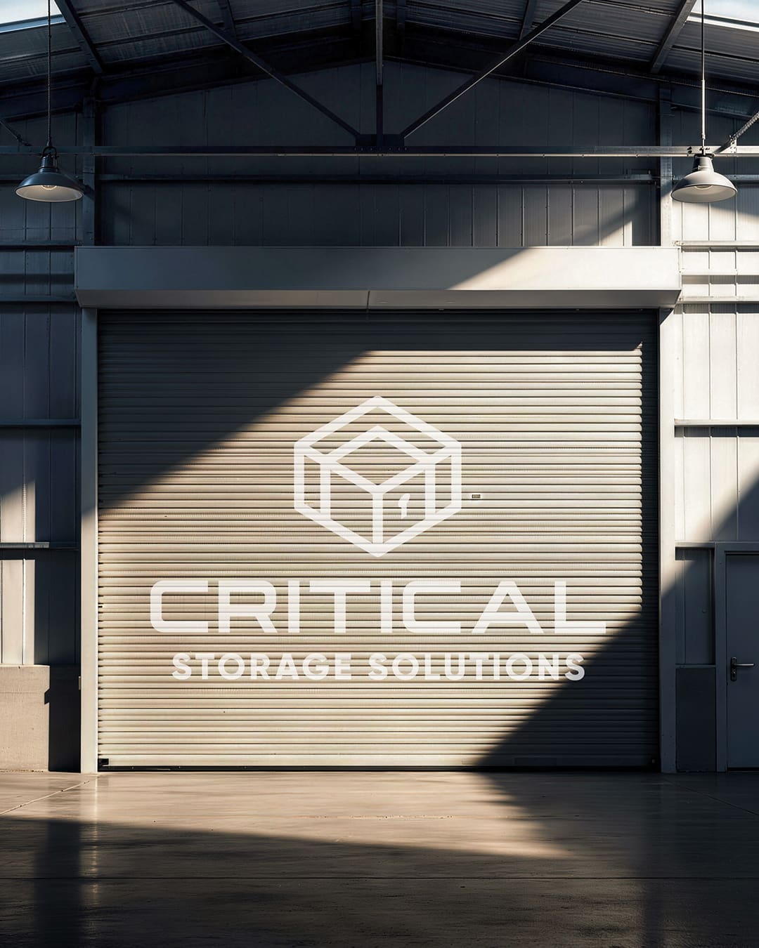
The brand identity centers on a custom cube-and-keyhole logomark that communicates physical security and scale. The outer shape represents a secure storage facility, the interior cube depicts crated equipment, and the integrated keyhole reinforces asset protection. Paired with bold typography and a red-and-blue palette, the brand establishes a strong standalone presence while preserving visual continuity with parent brand LEL. Arrowhead delivered comprehensive brand assets to support this rollout, including secondary mark variations, formal brand guidelines, and social media templates.
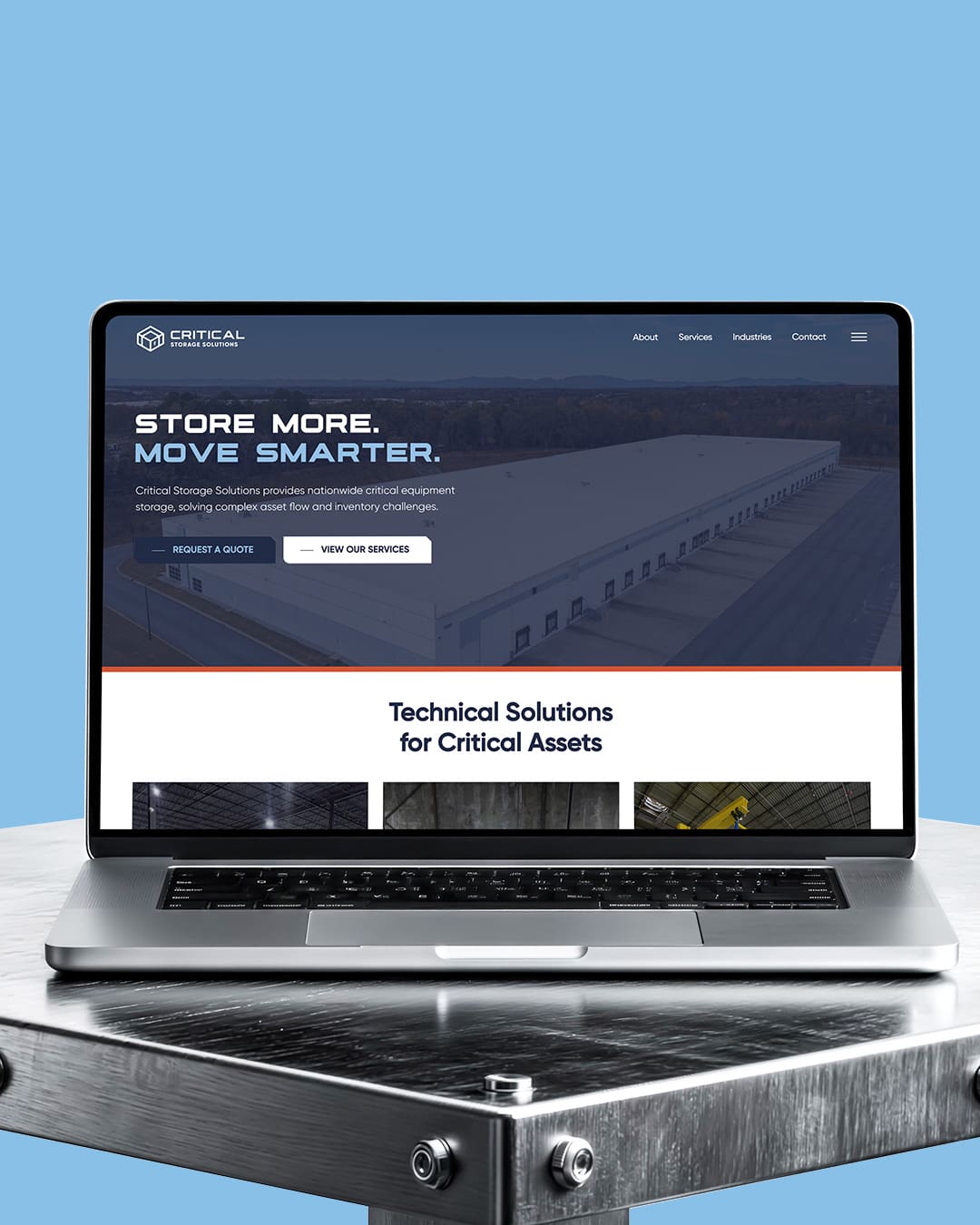
To bring the identity online, Arrowhead designed and developed a responsive WordPress website built around the client’s core service offerings. Structured navigation guides industrial buyers through specialized service areas, including inventory management, heavy equipment handling, staging, logistics, and field deployment. The site uses actual facility photography and leadership profiles to build credibility, supported by clear direct-response paths that allow project managers to request quotes or schedule storage planning consultations directly.