

Practicing What We Preach
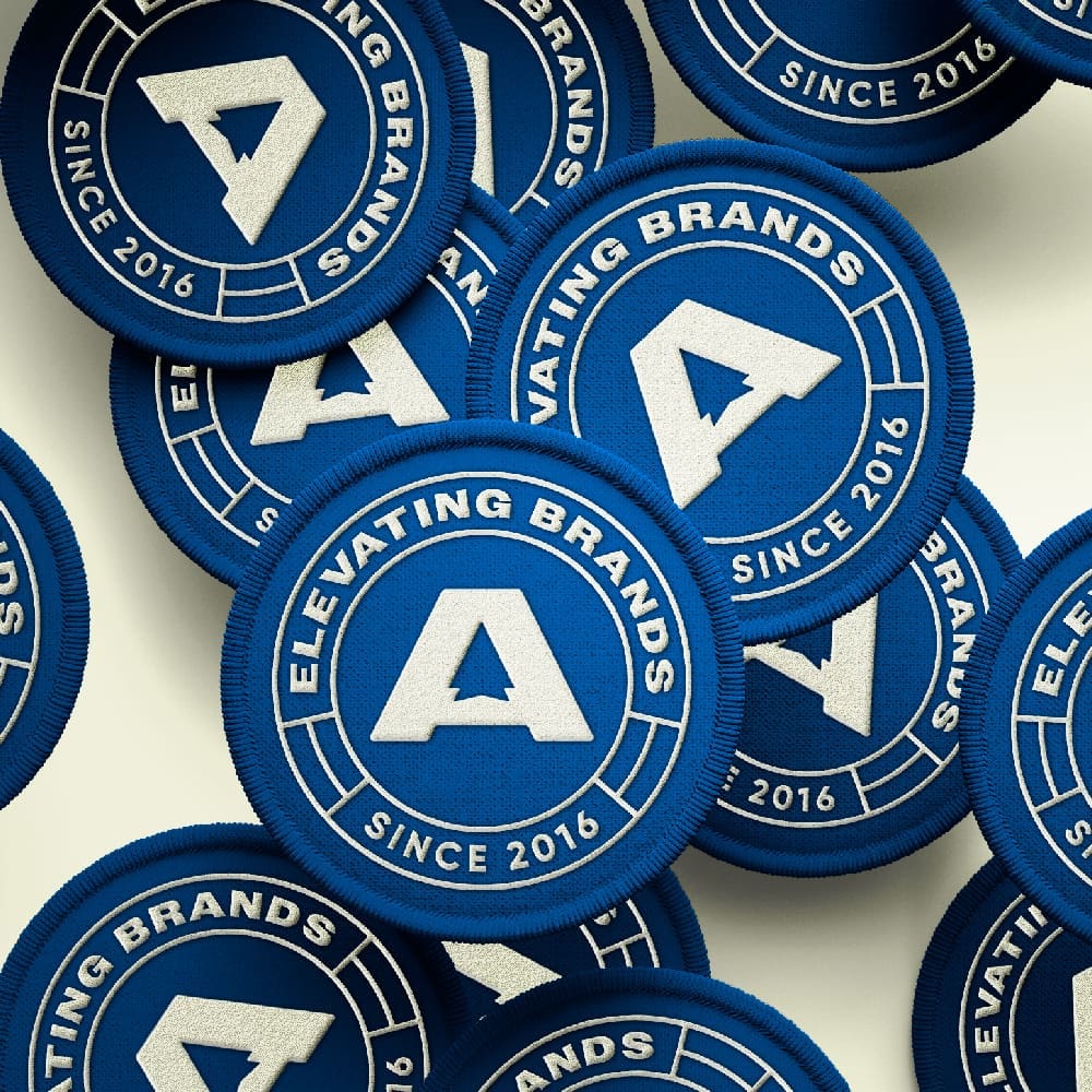
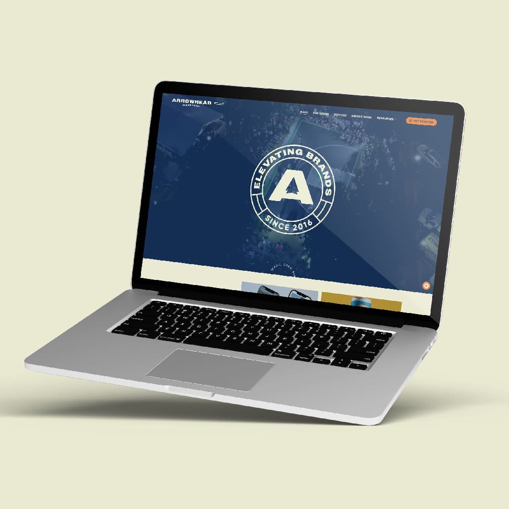
They say branding yourself is the hardest job a designer will ever take. After 8 years of helping Spartanburg’s finest businesses find their voice, we decided it was time to turn the lens inward. Our new look isn’t just a fresh coat of paint; it’s a symbol of where Arrowhead Design Group is headed in 2024 and beyond.
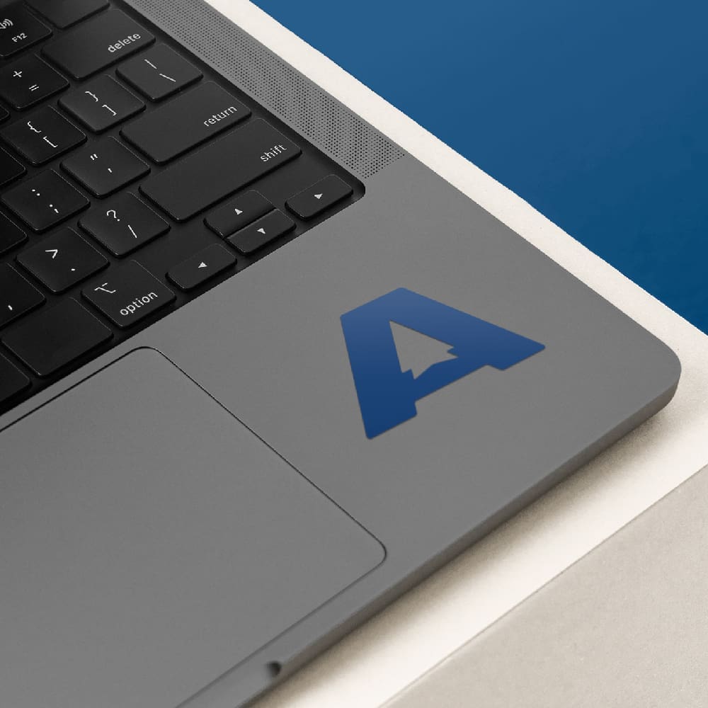
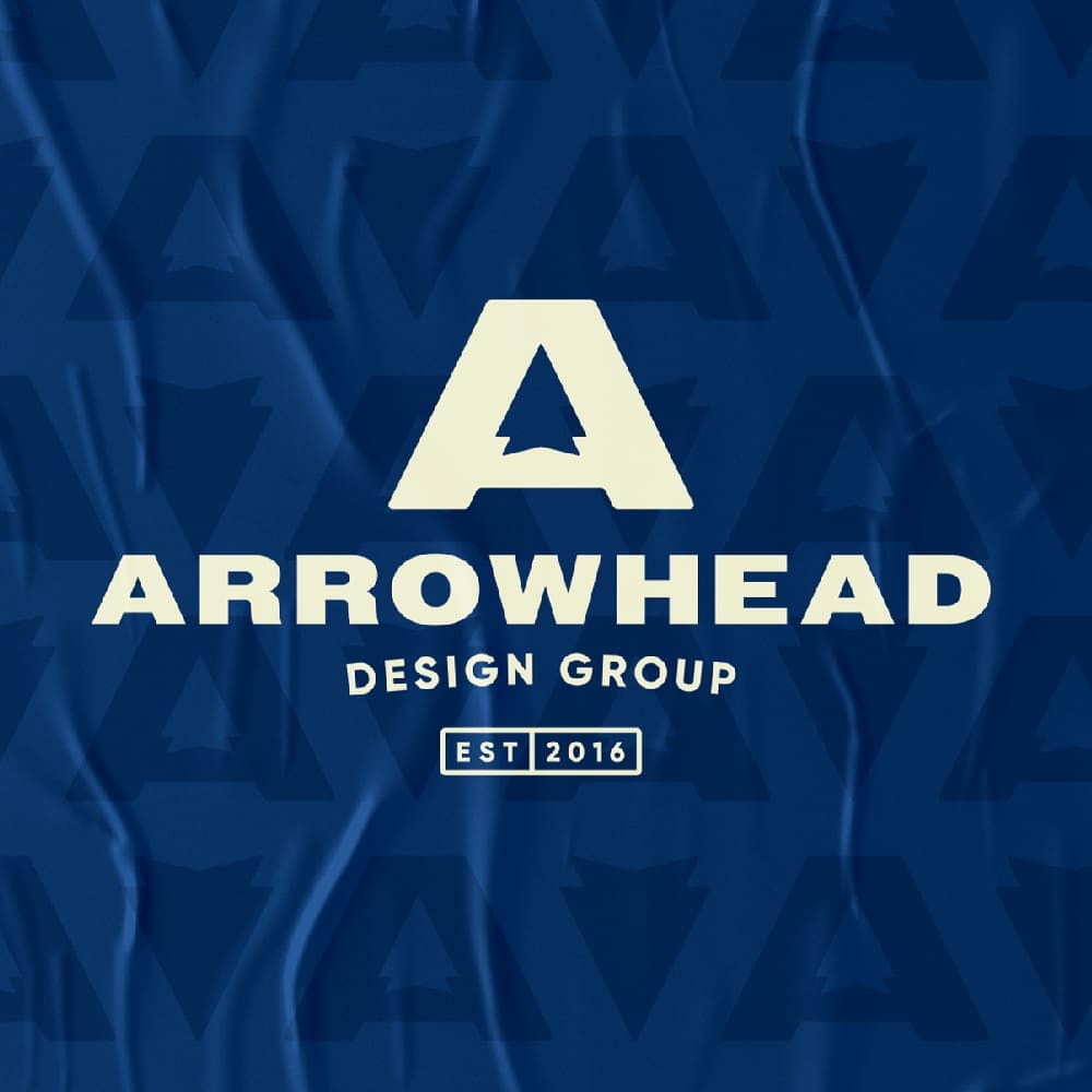
- Clever Identity Integration: We wanted our logo to work harder. By utilizing the negative space in the “A” to form our arrowhead, we created a mark that feels modern, smart, and uniquely ours. It’s a visual shorthand for the “hidden gems” and creative solutions we find for our clients every day.
- The Psychology of Color: We moved away from the expected and toward the upbeat. The vibrant blue establishes a foundation of trust and professionalism, while the orange and yellow accents inject the warmth and energy that our clients feel when they walk through our doors.
- A Beacon of Growth: This refresh is a reminder that standing still is the only real risk in design. By staying relevant and reflecting our own internal growth, we’re signaling to our partners that we are a forward-thinking team ready to handle the next generation of design challenges.
Refreshing a brand after eight years is about more than aesthetics—it’s about boosting confidence and reinforcing the high standards we set for ourselves. We’re thrilled to step into this new chapter with a look that matches our passion.