New Age Needlepoint came to ADG with a brand problem that a lot of small business owners in a traditional industry will recognize: the craft had real roots, a clear point of view, and a founder ready to push it forward – but the identity didn’t reflect any of that yet.
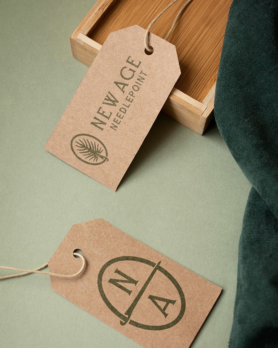
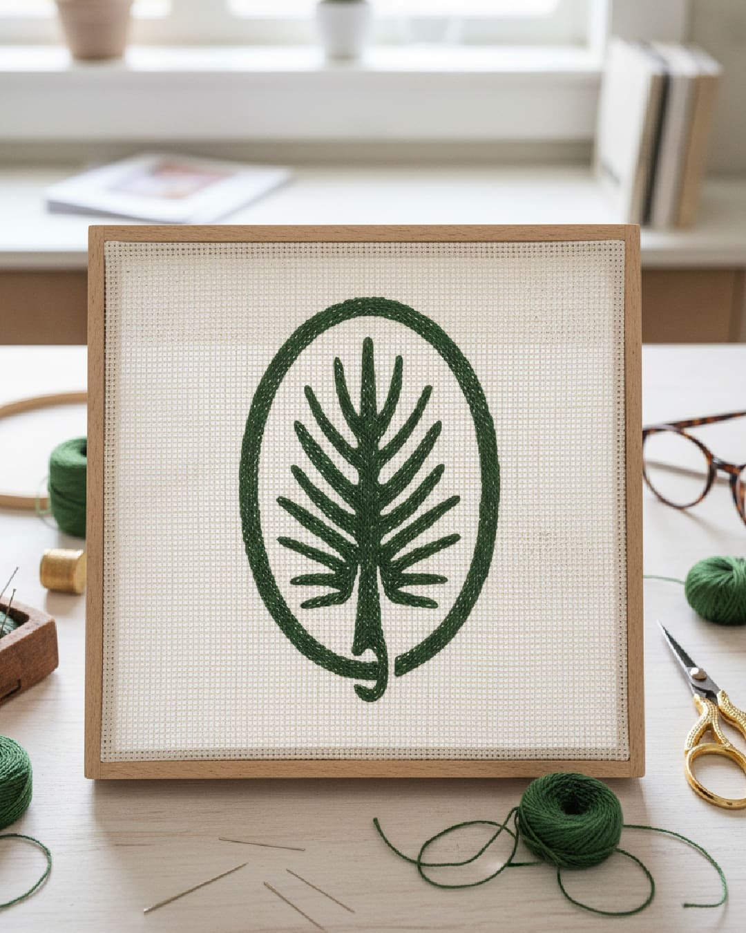
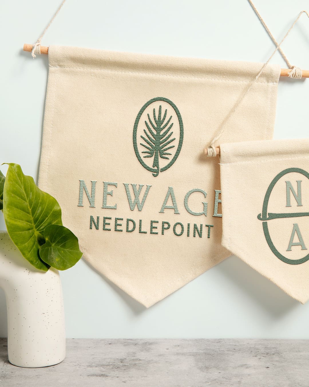
The owner was from South Carolina, and that shaped everything. Needlepoint has always been built around the needle – and so has the South Carolina pine. That double meaning became the foundation of the brand. The primary mark is a botanical oval featuring a stylized pine frond, a nod to her SC roots and a visual play on the craft itself. It’s specific enough to mean something, but clean enough to work anywhere.
That specificity matters because the needlepoint industry is, by most measures, still catching up. The category has been slow to modernize, with only a handful of competitors who have done the work to build brands that feel current. She knew that was changing – not just in aesthetics, but in the way the product is made. The industry is moving toward printed canvases alongside the traditional hand-painted ones, and she wanted a brand that could grow into that future without looking like it was built for the past.
We designed a full identity system with that range in mind. The primary logo pairs the pine frond emblem with a structured serif wordmark. A secondary monogram mark – the “NA” set inside a divided circle – gives her a versatile option for smaller applications like hang tags and product labels. The deep forest green palette ties it together: natural and craft-forward, but not rustic or dated.
The result is a brand that’s ready to compete – and built to last as the industry around it evolves.