
The High-Speed Handshake
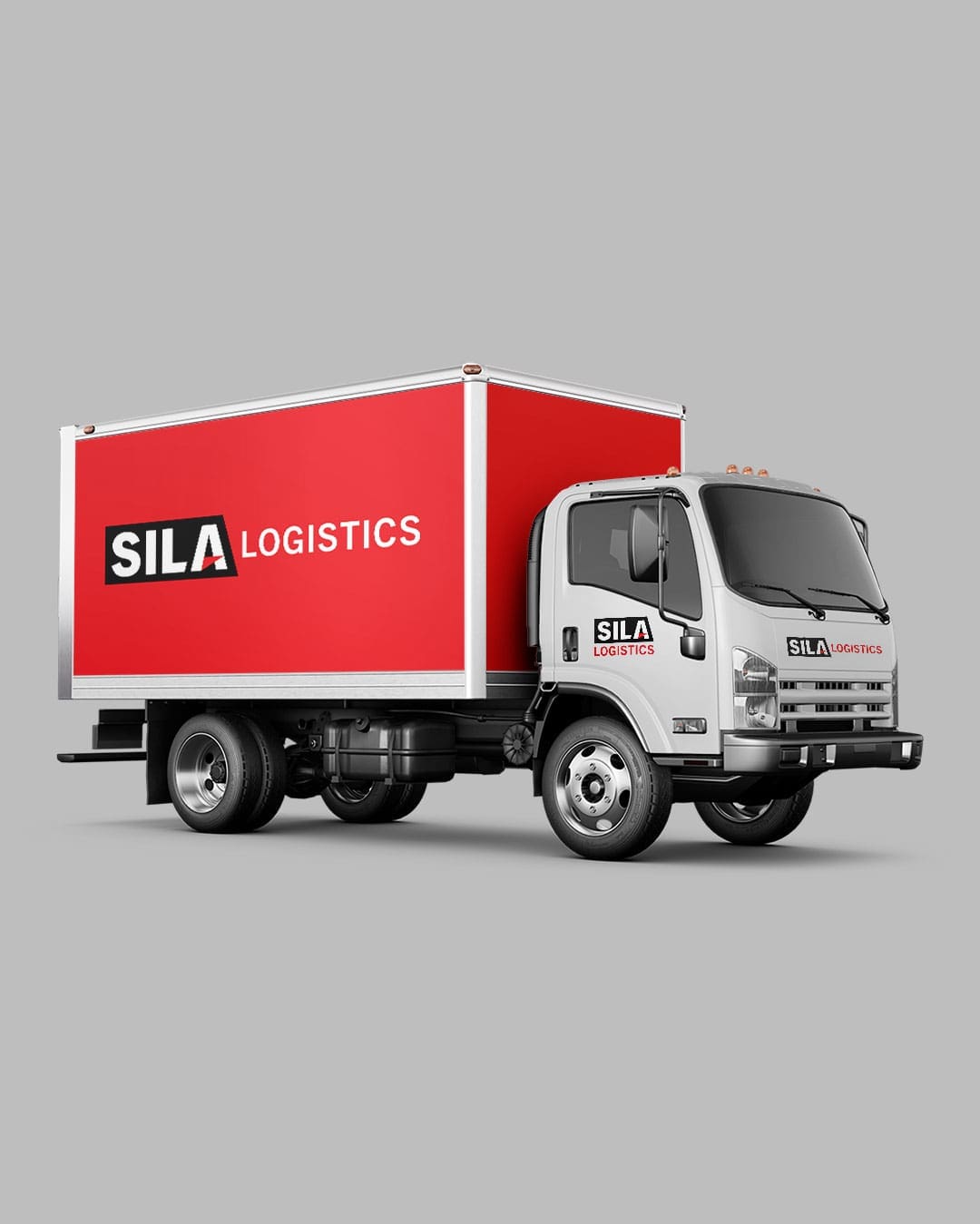
In the logistics industry, your truck is your biggest marketing asset. For Sila Logistics, the goal was simple: create a logo that looks as good on a business card as it does on a 53-foot trailer.
- High-Contrast Palette: We stuck to a classic red and black scheme. It’s an aggressive, professional combination that demands attention against both asphalt and sky.
- Designed for Legibility: We used a heavy, clean sans-serif font to ensure the company name is readable in a split second. No clutter, no unnecessary flourishes—just a clear, bold identity.
- Modern Lines: The subtle use of sleek lines suggests speed and precision, reflecting the core values of a reliable logistics partner.
The result is a functional, no-nonsense logo that gives Sila Logistics a professional edge every time their trucks hit the road.